
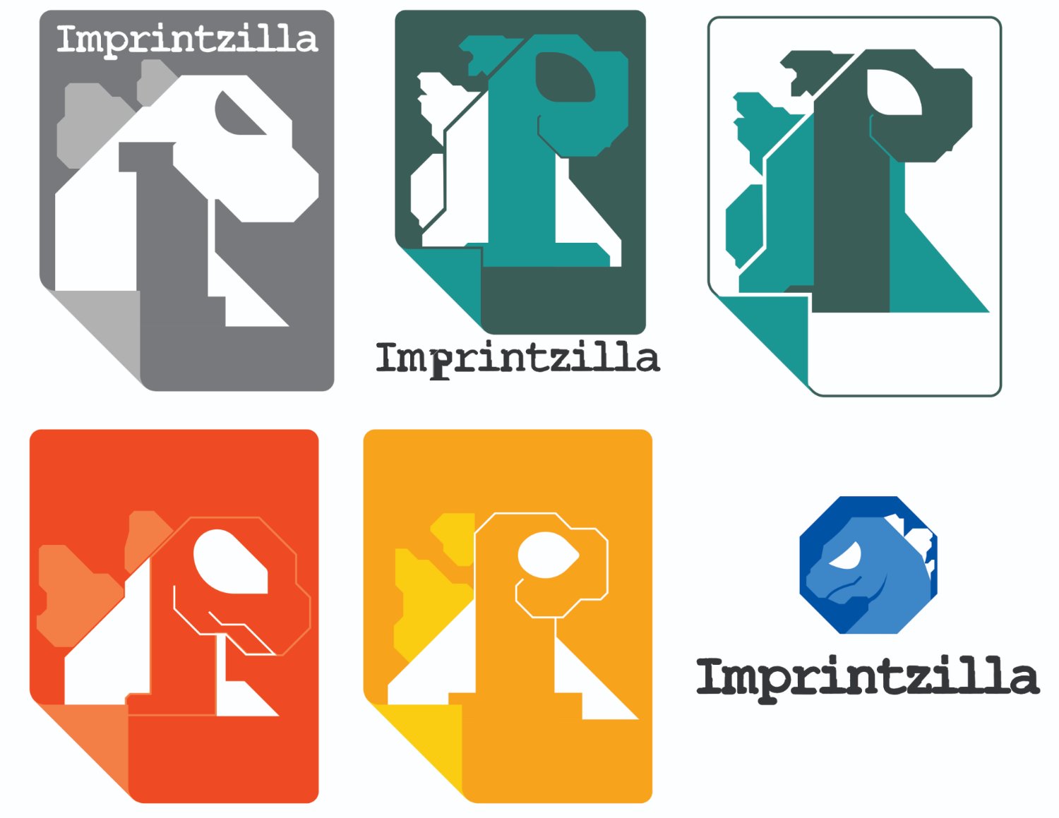
We are promotional garment decorators and my boss asked me to come up with a logo for our web portal, imprintzilla. His guidelines were, simple and ideally includes a dinosaur.
Here are a few designs I came up with, would love any comments or tips on what works, what doesn’t and how I cam improve on these.
top left because gojira
Bottom right is my favorite. The dinosaur is the clearest and it feels like a commercial product where the others feel a bit more like a hobby.
Thank you, surprisingly enough, that’s the one I put the lease effort into. i really wanted to try an incorporate some other element into the logo. One of the letters , “I” “p” or “z”, and something that relates to print, like a sheet of paper, similar to the google docs logo. But I agree the bottom left is the simplest and easiest to read as a dinosaur.
