

Transcription
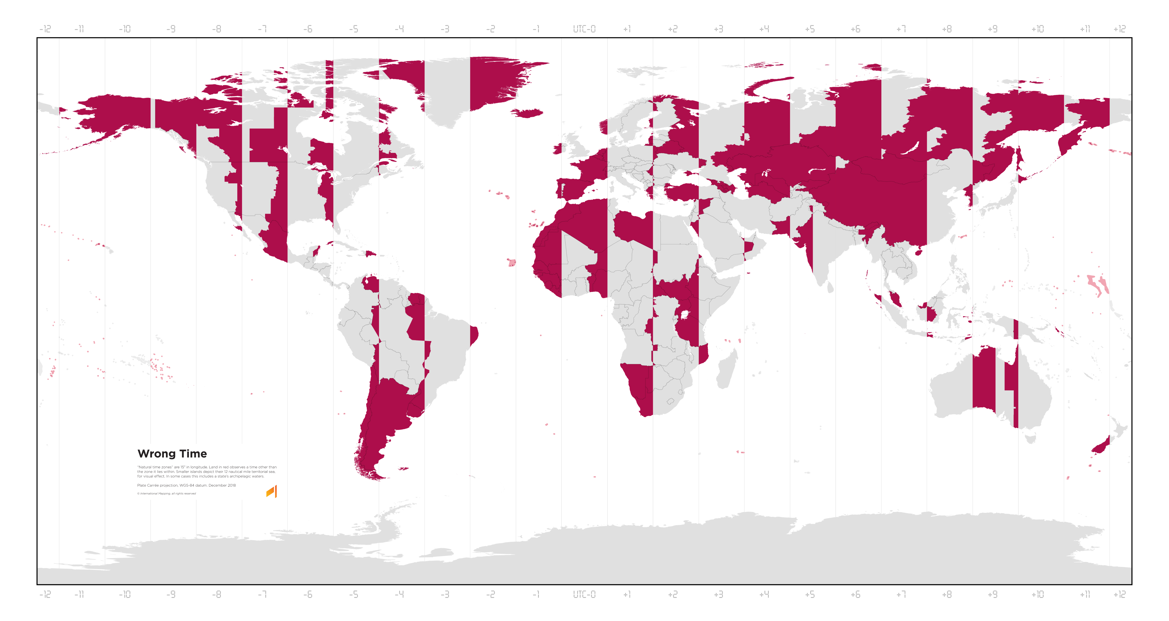
A map of the world with vertical lines marking the time zones from UTC-12 to UTC+12. It has a legend:
Wrong Time
“Natural time zones” are 15° in longitude. Land in red observes a time other than the zone it lies within. Smaller islands depict their 12 nautical mile territorial sea, for visual effect. In some cases this includes a state’s archipelagic waters.
Plate Carrée projection, WGS-84 datum. December 2018 © International Mapping, all rights reserved.
Lets just do a single time zone
I prefer the current way — I can be in another state or another country and I know that 7am is a good time for breakfast, around noon is a good time for lunch, and so forth. (If you don’t change latitude sure, just go outside to figure this out, but it’s complicated if it’s overcast, or the latitude isn’t what you’re used to, or…)
Time has a number of meanings — UTC is great for machines, local time is (IMHO) a good concept for humans.
Time zones are fundamentally wrong and immoral. Only the Time Cube is correct.
If you want a real trip click through the different archive dates on this site. Dude goes through a whole progression of who he’s pissed off at month to month.
Absolute classic.
I would have voted for the TimeCube guy over Trump.
Wrong title, it should be:
A Map of the world showing where the local time zone is wrong more than half hours
An hour is a human concept, we just divided the day to 24 parts, we could use whatever else division. Local time is correct only on the center longitude, which is a line with zero thickness.
Also it’s clearly visible that France and Spain are in the wrong time zone, and it was changed by the Nazis. Before WW2 France and Spain was in the same zone as Britain. France changed because of the German occupation, and they forgot to change back after the war.
Correction: Spain time zone was not changed by the Nazis, It was changed by the Fascists. Franco changed it to have the same time as Germany.
Fun fact: Have you seen videos of dogs begging for food the day after the time change, having to wait an extra hour? Spaniards were the same, and after the time change, they continued eating lunch and dinner according to their biological clock. That’s why Spaniards have lunch and dinner at later hours.
An item on my bucket list has been to create a map with “gradients” (really just 1-minute rectsngular bands) of what time the high noon is in that location. This map is just a subset of that, coloring red the areas with an over-30-minute offset. I’d make one for January and one for July to account for DST on both hemispheres.
I’ll probably convert a publicly available timezone shapefile into a Plate Carée (or similar) projection SVG, create a “gradient” spanning the entire globe and then use it as texture for the SVG shapes, horizontally offset appropriately.
This map really brings home how awful this projection is for this map’s purpose and how awful most projections really are near the poles. Greenland isn’t that big. I know this map is Plate Carree, not Mercator, but the size issue of an equirectangular projection is really similar when comparing longitude and size for the entire globe from pole to equator. 15 degrees of longitude for a timezone stops making sense that close to the poles. Greenland would mostly fit in the central time zone of the United States for example. Given its sparse population, dividing it up into 3 timezones seems unnecessary.
