
You’ve misread the graph (or I didn’t make it clear enough, this was 10min job!)
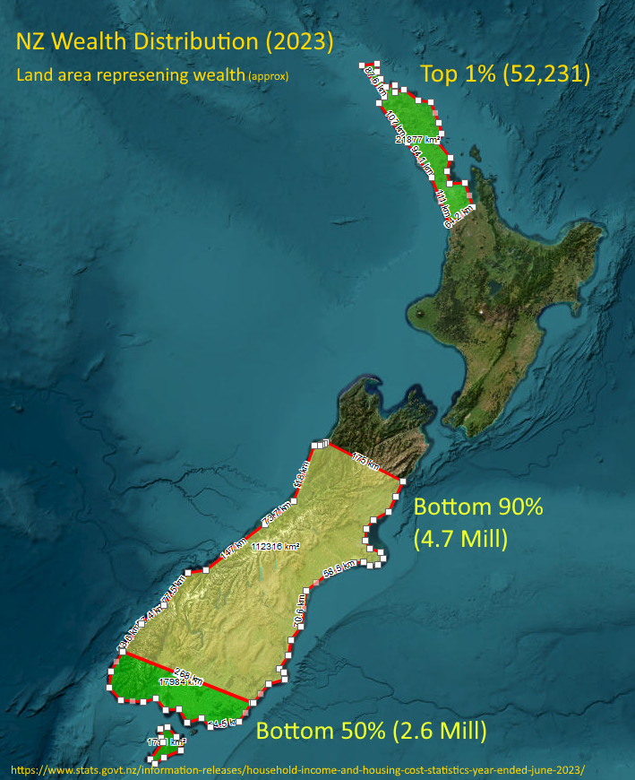
The land represents all of NZ’s wealth with each area highlighting the proportion owned by each percentage of the population. It is not a distribution of wealth by geographical region.
The source for the data used to build the graph is on the bottom of the image.
The source for the rest of my claims however, many can be found by a moment’s search, some others are anicdotal based on many years of watching news, learning, observing and life experience (hence the mention of the vibe).
Many of these (asset sales, welfare, tax changes, wealth redistribution, NIMBYism, trusts, productivity, union membership, productivity) and their impact on New Zealand and wealth distribution will be familiar to any kiwi who pays attention or who takes an interest.
People much smarter than me have written plenty of articles, published papers and worked through the stats over the years.

The areas don’t reflect the population, it reflects the wealth of that percentage of the population. Using the map is just so fun way to represent the values.
So, bottom of the south is the total wealth of the bottom 50% of the population (2.6m). From Kaikoura north is the wealth of the top 10% with the Auckland/Northland representing just the 1% (around 52k people) who own about the same as the bottom 50%